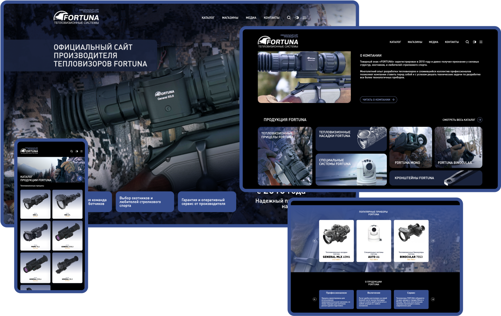
Website development for the manufacturer of thermal imaging and digital devices FORTUNA
Task
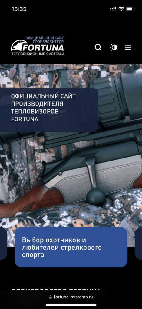
To develop an interface for an online store in a rather specific topic - hunting and weapons. The renders of the fixtures themselves are already beautiful and we wanted to use them as a base, but some additional decoration was missing
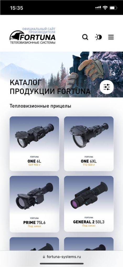
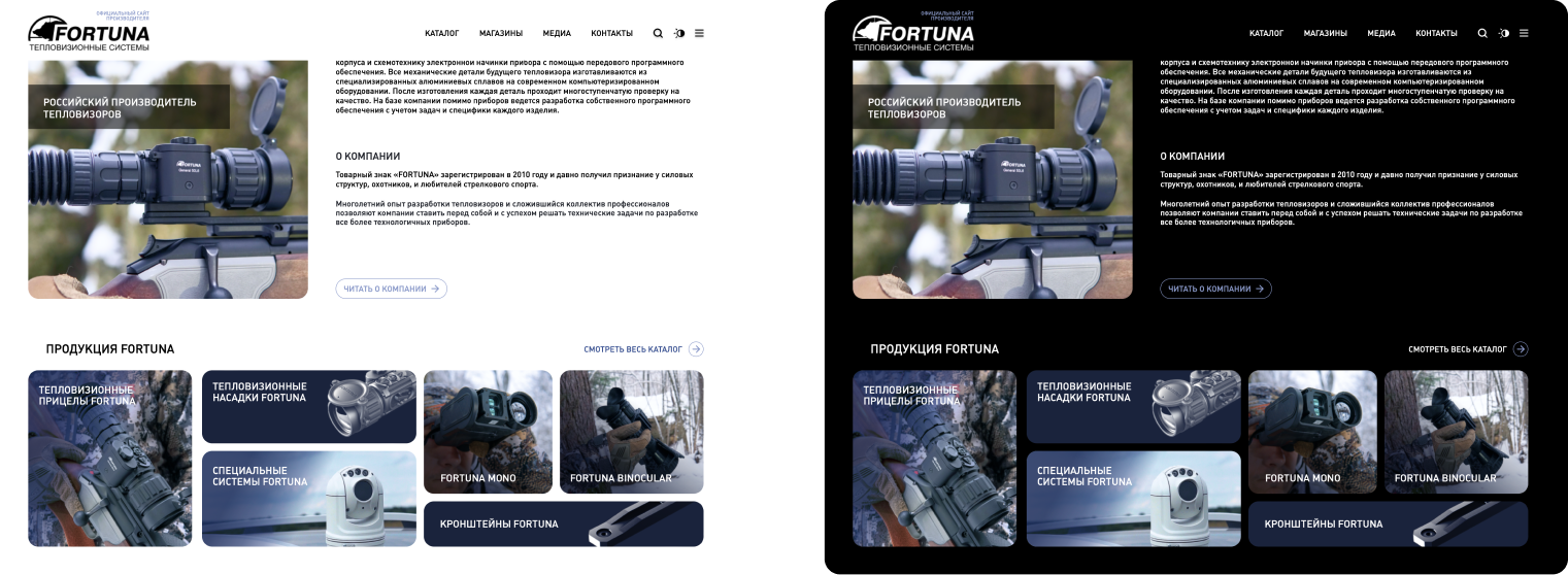
Day/night mode
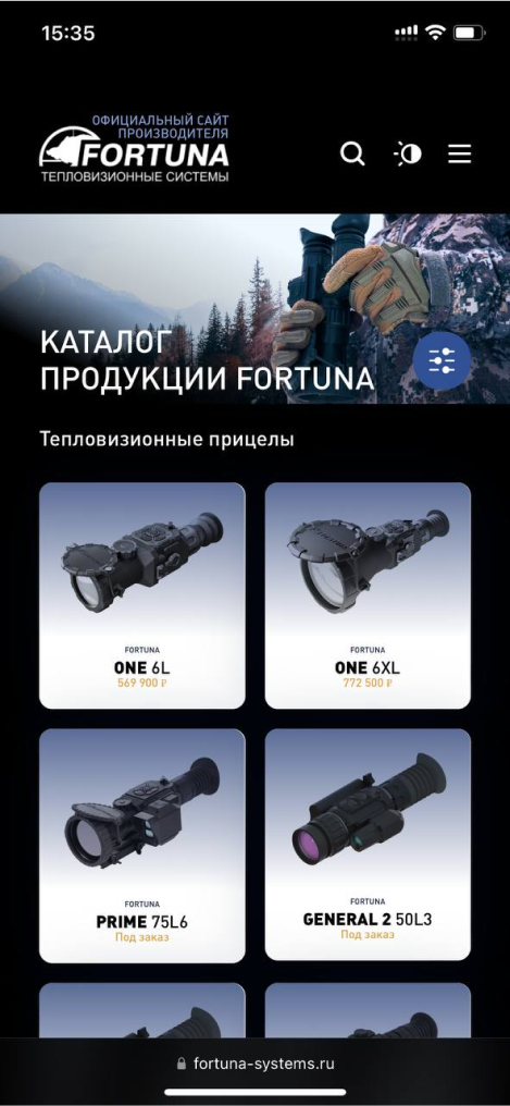
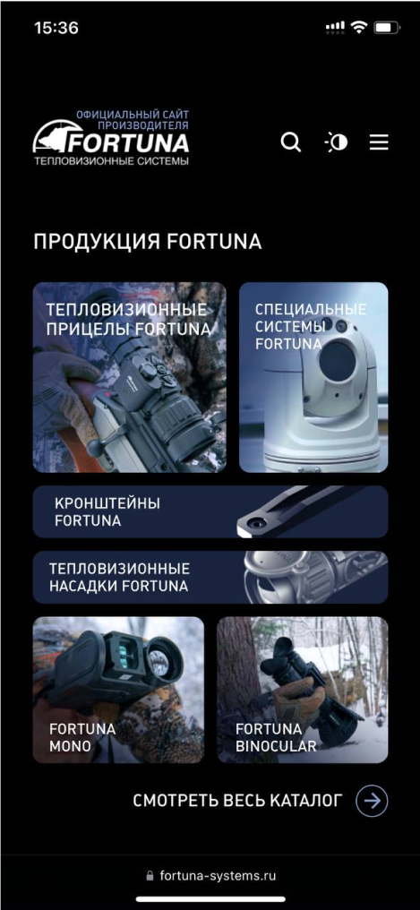
Throughout the site, we, according to our long-loved habit, used switching the mode of dark and light execution of the site. As expected, by default the site opens in the color scheme that is specified in your browser. Experience shows that users are zealously divided into two camps, some do not accept white sites, the second - dark ones. We satisfied both.
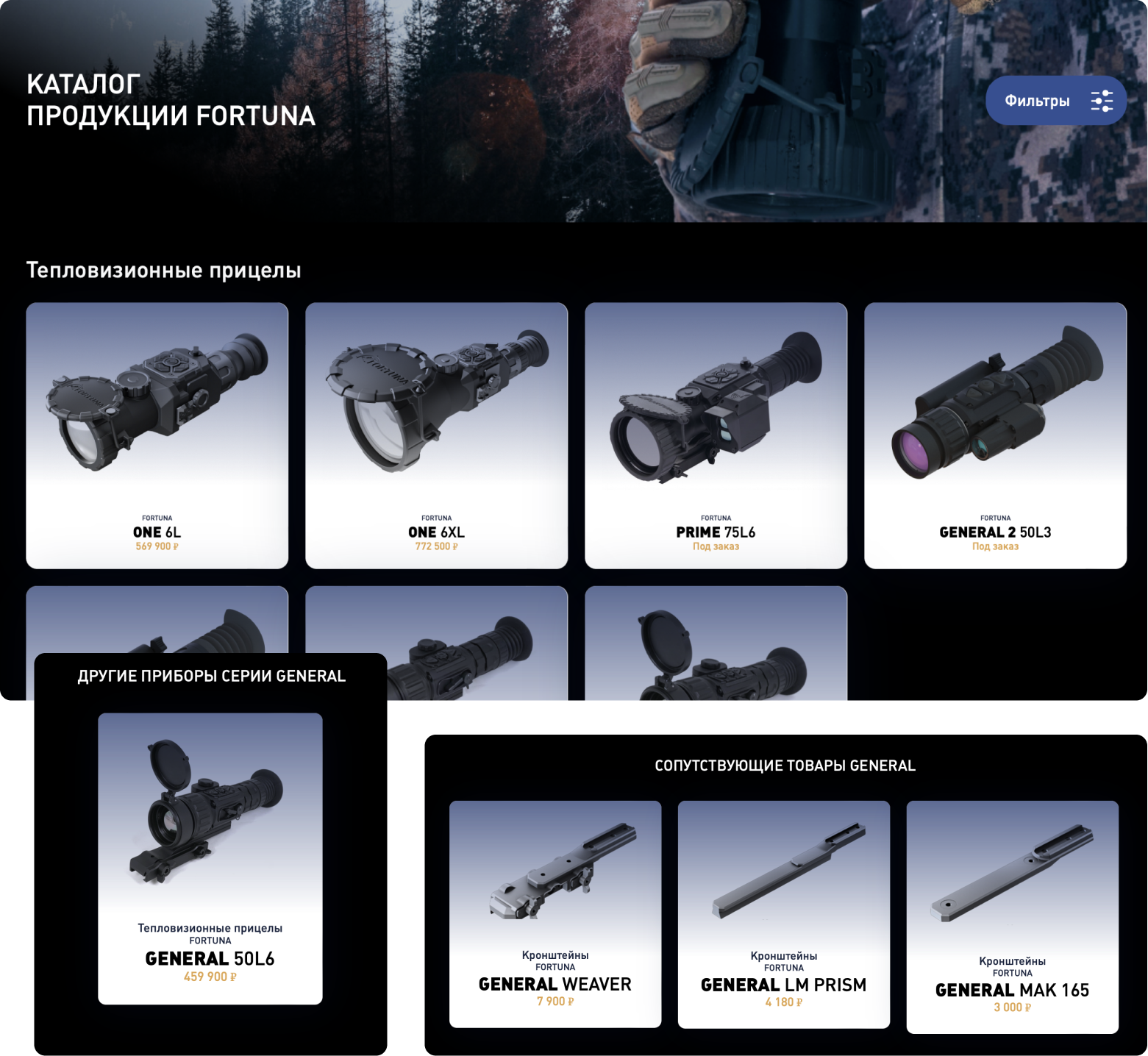
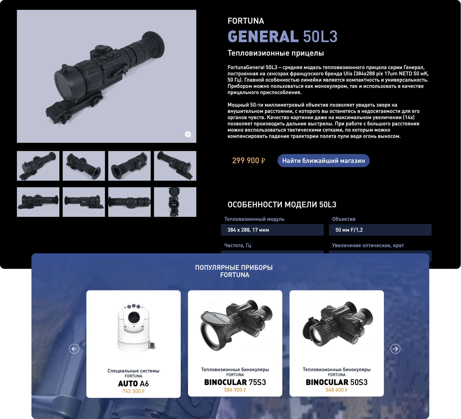
Catalog and product card
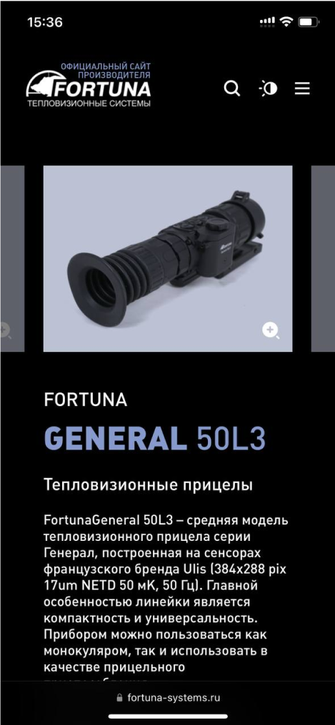
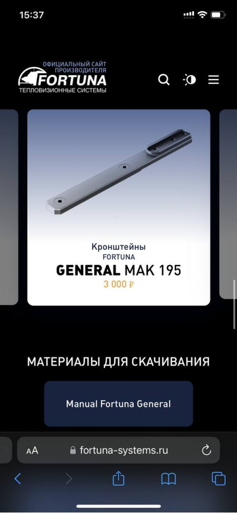
We didn't want to leave the preview of the products on a plain white background, so we added a light gradient overlay to set the depth and visual “softness” of the cards on the dark background.
We also deeply analyzed the structure of the catalog and further scalability, and divided categories, series and models infographically.
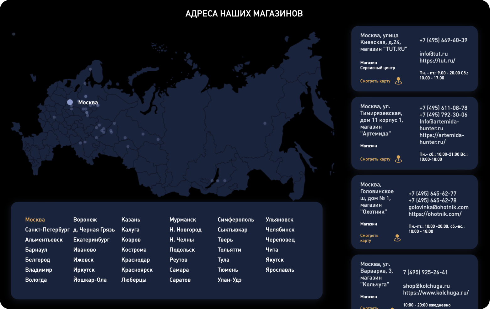
Store map
Fully editable from the admin panel interactive map with the ability to scale
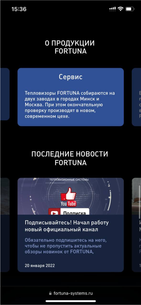
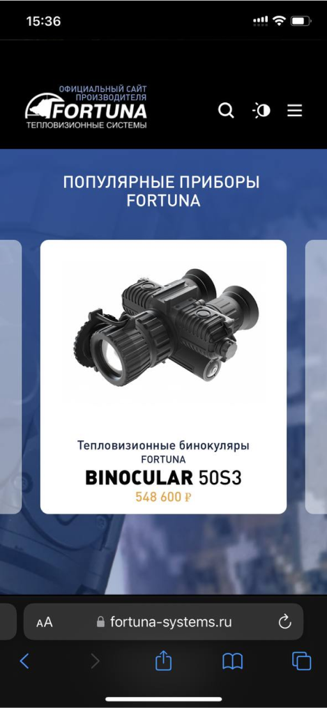
Mobile version
