Branding and identity for architect Darina Kazachenko
Logotype
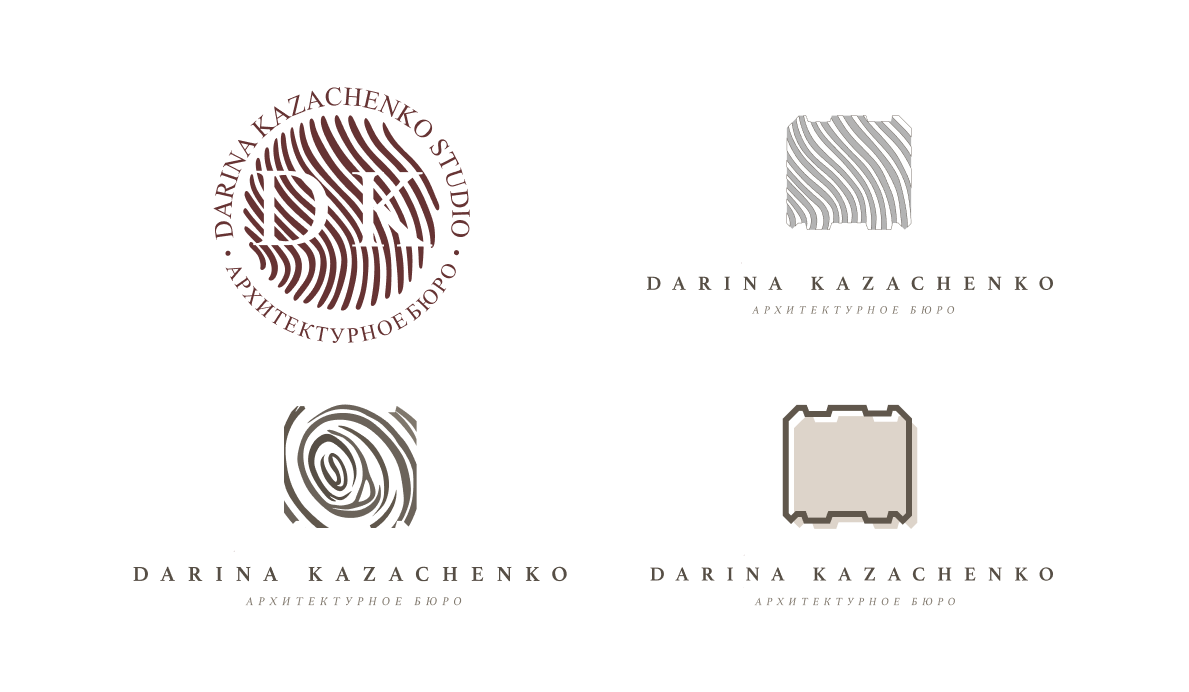
The task is to develop a logo for a suburban real estate architect. The main direction of the customer’s work is country houses and timber, so it was decided to take the texture of wood or the designation of timber in architectural infographics as the basis.
Brand identity
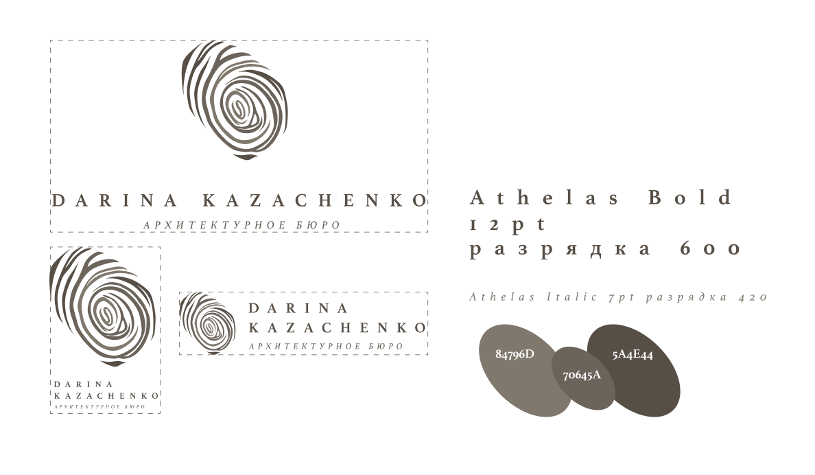
At some point, a cut of wood reminded us of the lines on a fingerprint, which became the basis for the sign. We started drawing this version and brought it to the ideal, which the customer really liked.
The color scheme dictated itself when viewing the client's portfolio. Obviously, wood dictates certain shades both in the interior and in the graphics.
Business card
Since the logo combined a cut of wood and a fingerprint, the business card was shaped in such a way that when it was pulled out, it seemed as if the fingerprint had just been left during transmission.

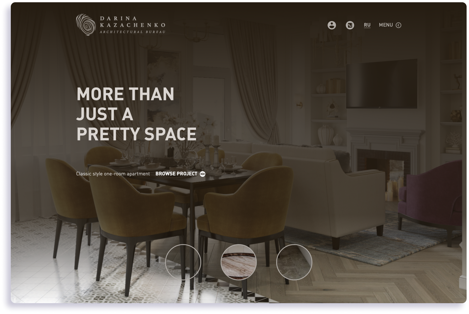
Portfolio website
After branding, an author's portfolio site was developed, with authentic infographics and a unique project navigation structure.